A logo that helps tell our story
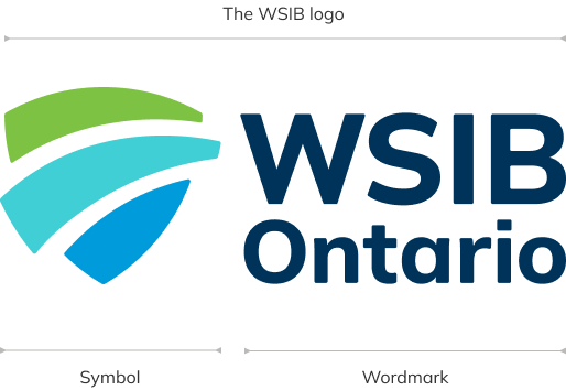
Our logo is comprised of our symbol and the WSIB Ontario wordmark. With the exception of an app or favicon treatment, the symbol and wordmark must always appear together as a unit.
The symbol portion of our logo is formed by three forward-moving shapes that create a shield. The three parts of the shield represent the WSIB and our healthcare partners together (in green) and the employers we insure (the darker blue) embracing and supporting injured or ill people (in the middle) as they move forward on the path to recovery and return to work. The underlying shield shape is the basis of our shield supergraphic, which lends a unique element to our visual style.
The wordmark portion of our logo is based on the Mulish font, which is our corporate font. It has been specially adapted in our logo to harmonize as a unit with the symbol.
This logo is used for both English and French communications.
Please do not attempt to create your own logo. If you need a file or have questions about the logo, please contact us at [email protected].
Full-name variations
In certain instances, we may opt to use our full-name logo arrangements. These arrangements are available as electronic art files and should never be created on the fly. Except for select approved instances, use of this layout arrangement should be avoided for programmatic or initiative identification, as we want to ensure that our logo represents our entire organization.
Full-name logo
English

Full-name logo
French

Full-name logo
bilingual

Stacked logo for limited use
The preferred and primary version of our logo has the symbol beside the wordmark. However, for very limited special situations where the horizontal space is limited, a stacked version is available. Decisions to use the stacked version of the logo must be made by WSIB Communications. If you have questions or need a stacked logo, please send an email to [email protected]
Clear space
Our logo must always be surrounded by a clear area that is entirely free of any other typography, graphic devices or busy backgrounds. This clear space around the logo is equal to 1/2 of the logo’s height. It is included in official electronic logo files.
Remember that the clear space buffer zone doesn’t drive the size of the WSIB logo. You can (and often should) increase the buffer without increasing the size of the logo itself. When you're trying to draw focus to the logo, increasing the clear space is often more effective than making the logo bigger.
Minimum size
Our minimum size is just that: the absolute minimum that our logo should appear. The minimum size should only be used when there's no other choice. Please try to use the optimum size every time you use the logo. If you need help, please contact [email protected]
Colour and clarity
For greatest clarity and visibility, our logo should appear on Trillium (white), Midnight or Frost. More information on our colour palette and how we use it can be found in the Our colours section.
The preferred version of our logo is in full colour. Please avoid using one-colour treatments unless absolutely necessary.
Full-colour positive logo on Trillium (white)
Full-colour reverse logo on Midnight
Full-colour positive logo on frost
One-colour positive logo (black) on Trillium (white)
One-colour reverse logo on black
App and favicon
A simplified treatment may be used for app icons and avatars to ensure visibility in small-scale applications. Any other simplified or adapted treatments must be approved by WSIB Communications.
App icons
App icons
Favicon

The don’ts
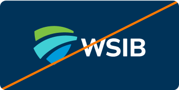
The WSIB logo is our most precious brand asset. Help to protect it by ensuring it’s seen consistently. Always use official artwork and don’t modify it in any way.

Don’t add to or remove elements from the logo.

Don’t modify, rotate or distort the logo, or any of its elements
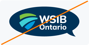
Don’t place the logo in another shape or add a border.

Don’t crop or mask the logo.

Don’t alter the logo colours or place it on unapproved colours
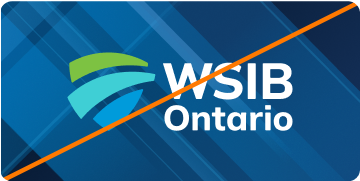
Don’t place the logo over a busy image or pattern.

Don’t use the one-colour logo if it can be used in full colour.

Don’t separate or rearrange the logo elements, except in in approved applications.
Don’t remove “Ontario” from the logo.
For the WSIB logo suite or any other inquiries, email [email protected].