The shield that protects Ontario
The symbol portion of our logo is formed by three forward-moving shapes that create a shield. The underlying shield shape is the basis of our shield supergraphic – a Reuleaux (curved) triangle inspired by the shape created at the centre of the three-pointed trillium that is our province’s symbol. This shape lends a unique and connective element to our visual style.
How we use it
The rounded aspect of our shield supergraphic reinforces the very human organization that we are. This shape is used to create zones for imagery and text panels, and to add visual interest.
When using the shield supergraphic, typically only one or two of its sides should appear in the overall design. Some layouts may also work well when a top corner of the shield is included to emphasize forward motion and energy. Take care when including a corner that the overall layout is positive and doesn’t appear “aggressive.” We also avoid using the lower part of the shield supergraphic in a way that creates a downward point. As we further develop our visual style, please check in with Communications if you’re working on a layout using corner cropping. We generally want to maintain emphasis on the curves and how these can support upward, positive eyeflow in our layout.
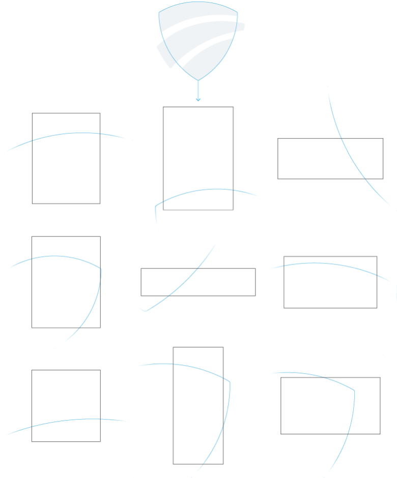
The diagram below shows the source of the shield supergraphic and examples of how this shape can intersect with layouts.
When applying the shield supergraphic, use the digital files provided. Don’t redraw the shape.
Below are a few examples of how the shield supergraphic can be applied. It may be helpful to begin the design process by considering where the main headline and the WSIB logo will appear. Remember the logo may only appear on one of three colours. If you begin with this, you can then work through the other elements of your design to ensure a good visual hierarchy is created.


In photography
A transparent shield supergraphic layer can be brought into an image. This shape may appear in our primary or primary accent colours. The opacity can vary between 30% and 80% depending on the image background colour and the selected colour from the palette. Aim for a balanced and harmonized impression.
Close-cropping foreground elements in the image (i.e. the people in the image below), can add an interesting depth to the image and create focus.


In animation
The shield supergraphic can be used in animations to support the story. Here is one example where the multiple shield supergraphics create a story of support, connection, togetherness with a future focused and forward movement.

In the example below, the shield supergraphic incorporates motion to reveal an image.

For any question or other enquiries, email [email protected].