Our fonts reflect who we are
Our brand fonts have been selected to carry our voice consistently across all of our communications – a voice that uses simple, plain language to connect to the people we’re talking to in a helpful, personal and human way. We also format our copy in layouts to bring our straightforward, helpful tone to life. This section of our brand guidelines includes the basics of our brand fonts and how we use them to reinforce the human organization we are and to deliver messages with clarity.
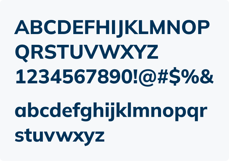
The simplicity and clarity of Mulish
Our external-facing brand font is Mulish, and we use it for most of our public communications. We chose Mulish because it's friendly, straightforward and easy to read. It's also an open-source Google font and can be downloaded from the Google Fonts site.
Mulish is considered a minimalist font, and was designed to work well for body copy as well as headlines. In the character set below, you will see the simple harmony that characterizes Mulish.
Mulish is available in a variety of weights, giving us ample opportunity to ensure our layouts are scannable and easy to visually process.
If you need something designed in Mulish, please work with the Communications team. You can reach them at [email protected]
Arial for Microsoft documents and forms
There are two key exceptions to the use of Mulish – for Microsoft documents and forms that are shared online. For these, we use Arial instead. Since Microsoft documents and our forms are often shared with those outside our organization, using this universally available font ensures that our text appears the same for everyone. The WSIB has created MS templates that follow the brand guidelines and accessibility requirements. These templates should be used for creating any MS documents from the WSIB. WSIB employees can find these templates on our internal Templates and style guides page.
Our typographic style
Typographic layout goes a long way to reinforcing our straightforward, helpful tone. Keep these approaches in mind.
Make it scannable:
- Keep sentences and paragraphs brief and to the point.
- Break up content into smaller chunks with short subheads.
- Use bullet points or numbers to make lists easier to read.
- Use left-alignment in formatting.
- Keep leading at auto or slightly more open to improve readability.
- Maintain standard tracking – don’t go too loose or too tight with letterspacing.
- Use a single space after periods.
Make it relatable:
- Use headings and titles that are short and easy to understand.
- Use sentence case (not title case or all capitals) for headings and subheads to convey our human and approachable voice, and make them easier to read.
- Use bold, not underline or italic for emphasis (underlines are reserved for hyperlinks).
- Use emphasis sparingly and strategically.
- Avoid using the ampersand (&) in sentences, job titles or the names of departments.
Use italics sparingly:
- Italics are harder to read and should generally be avoided in layouts.
- Please follow standard style guides and italicize titles of publications and other works if they are books, journals, movies, magazines and/or plays. Don’t italicize the titles of articles, chapters or poems.
Working with colour
Accessibility is a vital consideration for any communications we produce. Refer to Our colours for specific information on what colour options to use for typography.
Our standard formatting approaches
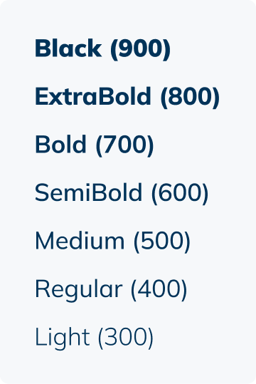
Mulish offers a lot of flexibility because it comes in a lot of different weights. Our digital design system outlines font styles for online applications. As a general rule of thumb, please use the following styles as a starting point for design to help keep our brand consistent:
Headings are generally set in Mulish Extra Bold.
We generally use Mulish
Extra Bold for primary
headlines
Subheads should typically be set in Mulish Bold or Extra Bold.
For subheads we use Mulish Bold or Extra Bold
Body copy should be set in Mulish Regular. Use line spacing between paragraphs instead of indents.
For body copy we generally use Mulish Regular.
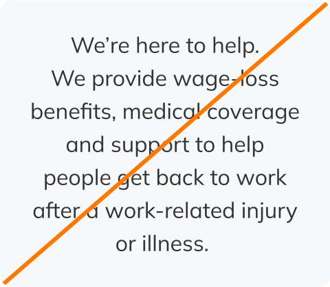
We’re here to help. We provide wage-loss benefits, medical coverage and support to help people get back to work after a work-related injury or illness.
We are funded by premiums paid by Ontario businesses. We provide no-fault collective liability insurance and access to industry-specific health and safety information.
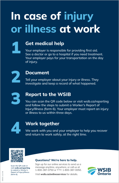
The poster below shows how our rule of thumb styles for headings, subheads and body copy all work together to help with readability and scannability.
Word and PowerPoint templates are available on the WSIB intranet. If you have questions about the templates or need access to the digital design system, please email [email protected]
Word emphasis in headlines
One of the distinctive elements of the WSIB brand style that sometimes appears in things like social graphics and posters, is the use of colour in headlines to create emphasis and focus. However, choosing the correct words to highlight, and ensuring accessibility is vital. Refer to Our colours for the accessible colour combinations that can be used.
We are one of the largest insurance organizations in North America
Word emphasis in body copy
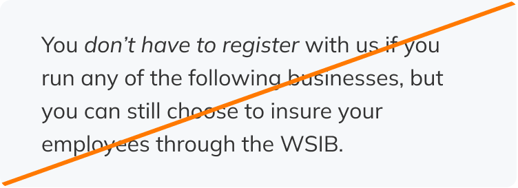
Where emphasis is needed within a sentence or in body copy, use bold text. Don’t use italics or capitalization.
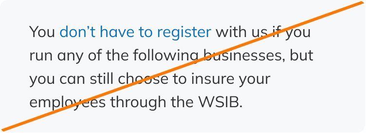
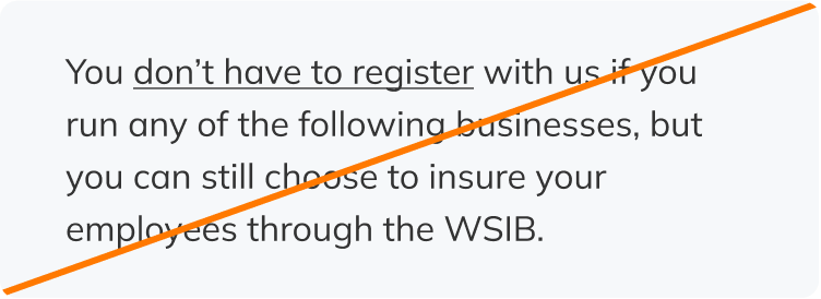
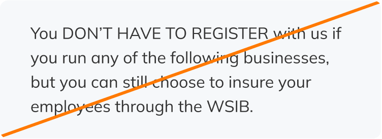
You don’t have to register with us if you run any of the following businesses, but you can still choose to insure your employees through the WSIB.
Don’t use italics to emphasize text.
Don’t use colour to emphasize text in body copy.
Don’t use underlining to emphasize text. This treatment is reserved for anchor links.
Don’t use all caps to emphasize text. This comes across as shouting.
Alignment
To keep our layouts easy to read, text should always be left-aligned. Avoid centred, right-aligned or left-and-right justified text.
We use left alignment for our text – whether headings, subheads or body copy.
We provide wage-loss benefits, medical coverage and support to help people get back to work after a work-related injury or illness.
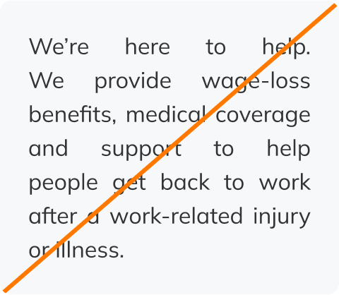
Don’t centre align blocks of text.
Don’t right align blocks of text.

Don’t justify blocks of text.
For any question or other enquiries, email [email protected].